Moviescope Magazine has a great article on Spartacus. Their May/June issue features the article. Barbara Davies sent in the following exerpt from the magazine and you can purchase it from MovieScope.
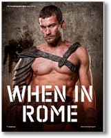
When In Rome
MovieScope Magazine / June 2010 Issue
Love it or hate it, controversial new TV show Spartacus: Blood and Sand is like nothing you’ve seen before—on the small screen, at least. DoP Aaron Morton explains how he achieved cinematic visuals for a television audience.
If you haven’t heard of Spartacus: Blood and Sand, you soon will. The TV show following the life of the legendary gladiator slave, which has been both applauded and chastised for its unflinching sex and violence, is to hit UK channel Bravo in the summer. A heady mix of bloody battles, political intrigue and steamy romps, it employs green screen and effects techniques usually seen in blockbuster movies. But, although comparisons with films like 300 are inevitable, New Zealand based director of photography Aaron Morton has made it his mission to make Spartacus unique. “We didn’t have a graphic novel like 300; they had a blueprint for their visual direction. We were searching for our own look, we were finding out way over those first few shows, and wanted it to pack a bit of an early punch!”
And pack a punch it certainly does, but Morton is quick to point out that it’s not “sex and violence for its own sake. It’s grounded in decent writing, and there’s always a story point involved.” A series that concerns itself with life in gladiatorial Rome was never going to be family viewing, but Morton admits that the stylised visuals are used as much to make the show’s themes more palatable as to set it apart. “I wouldn’t want it to feel like a snuff movie! It’s obviously contrived. There’s these gritty bad guys who kill other dudes, so I didn’t want to make it glamorous!”
…
This article continues in movieScope Magazine, Issue 17 (May/ June 2010)
